
Want to know how to choose the perfect color scheme when creating websites and web templates? Get inspired by the top color schemes we’ve seen so far in 2022.
Why is a website color scheme important?
On a psychological level, colors make quite an impact. Every color evokes certain emotions, and wrong pairings of colors can negatively impact the perception of a website or web template.
As a general guide, colors like red, yellow, and orange serve to grab attention. Neutral colors like white, grey, or baby blue evoke a sense of calm, or create a contrast to make things ‘pop’.
So, picking the most effective color scheme for your websites and web templates can be one of the most important ways to make your work stand out from the crowd.
5 trending website color schemes we’ve seen so far in 2022
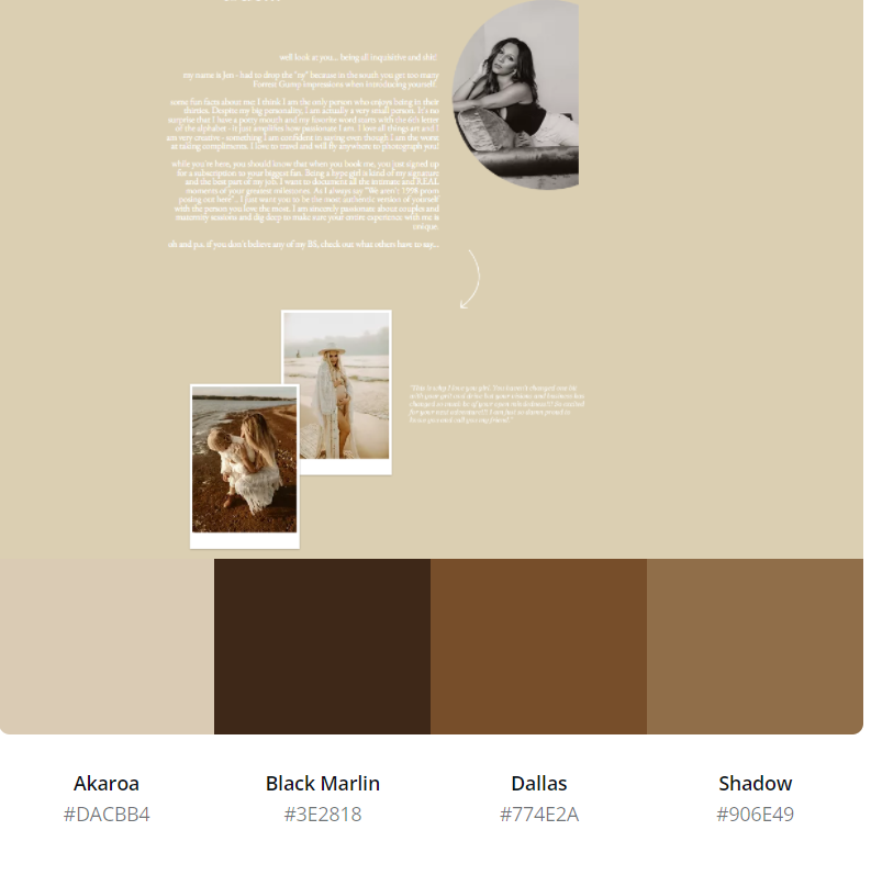
1. Neutral and Earthy Colors
Inspired by earthy tones and natural materials such as linen, wood, and plants, neutral colors are popular with customers who need a more natural look or organic design for their website– such as this example from Jen Pierce Photography.
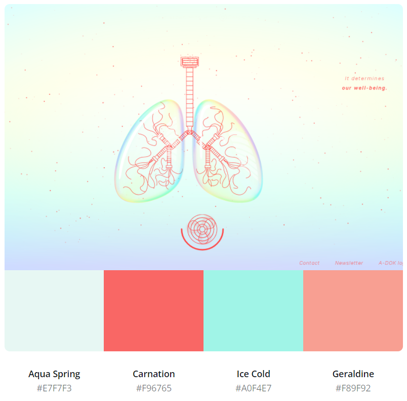
2. Pastel Colors
In 2022, many brands have turned to soft pastel colors in their website designs. Soothing and calming, pastels make for a stunning website background, accent, or even just a pop of color.
Although pastels aren’t the boldest color choice, there are ways to incorporate it into your website and web template items – like combining them with geometric shapes, strong lines, and neon colors. For example, this website from Save The Air pairs pastel aqua with a vibrant red to add power and energy to the design.
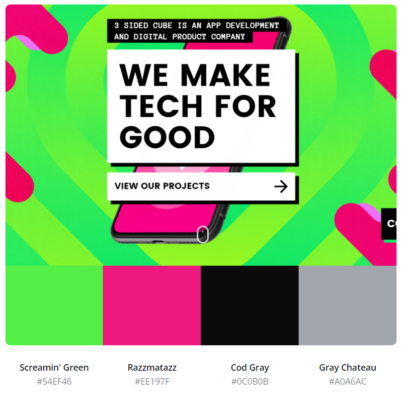
3. Bright and Bold
Using bright colors is a great way to draw our customers’ attention to your website or web template item. Bright colors are playful and exuberant, making for a memorable and eye-catching design that customers’ will want to make their own. Pairing hot pink with bright green, followed by massive typography, 3 Sided Cube’s website creates a bold, eye-catching design that communicates the brand’s personality.
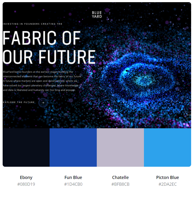
4. Futuristic Dark Mode
Looking to create an eye-catching web or code item? Combining dark colors with bright blues and purples is perfect for creating a mystical and futuristic atmosphere. Contrasting these colors can help establish a hierarchy on a website, shifting attention to the essential parts – such as this example from Blueyard.
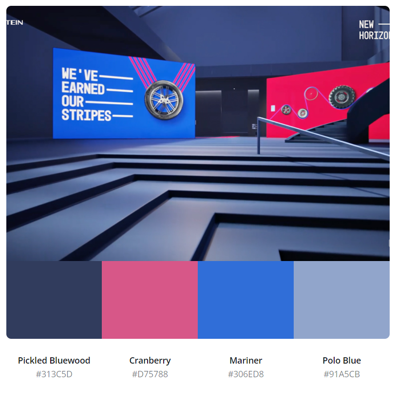
5. Primary Colours
Sometimes, a website design just calls for a color palette of simple, primary colors. When appropriately combined, these colors can be great for evoking certain emotions. For example, blue represents trust and stability, while red stands for power and excitement. And, when combined like this example from vredestein, they can be an effective tool to build trust and create a call to action.